Matt Yglesias posts yet another chart of government spending and claims that its point is so obvious that no further comment is required. This is just one in a long series of supposedly killer graphs going around the blogosphere. In doing so he makes the implicit argument that stimulus spending should be viewed as normal trend spending. I think Yglesias knows better, but thousands linking to him do not.

This is Yglesias’ chart of nominal federal expenditures from FRED. Kudos to him for using total expenditures, which includes Social Security, etc., instead of the GDP breakdown where SSI is included in personal (private sector) income. Brickbats for not inflation-adjusting or % of GDP
Yglesias has pulled down the ‘total federal expenditures’ data from FRED. This is the right series to use for the Federal Government, as it includes government outlays for social security. Since these items are not “Final Consumption”, they are often not included in the figures from BEA or FRED when people use the GDP series, which is misleading (they show up when spent in private consumption rather than government consumption).
I prefer to use the TOTAL government expenditures series (including state and local spending), since nearly $1 Trillion passes from the Federal government to the states (the accounting in the above series can be funny on this), and it gives a more complete picture of government’s footprint in the economy. It is really important to think about two things in long time series: First, are you using consistent units? One option is to adjust to real dollars (like this)

Real Federal Outlays
Another is to show per capita spending, which demonstrates how much the government is spending on each of our behalf, performed here by Veronique de Rugy:

Federal Outlays per Capita – How much the Federal Government is shelling out for each person in the US.
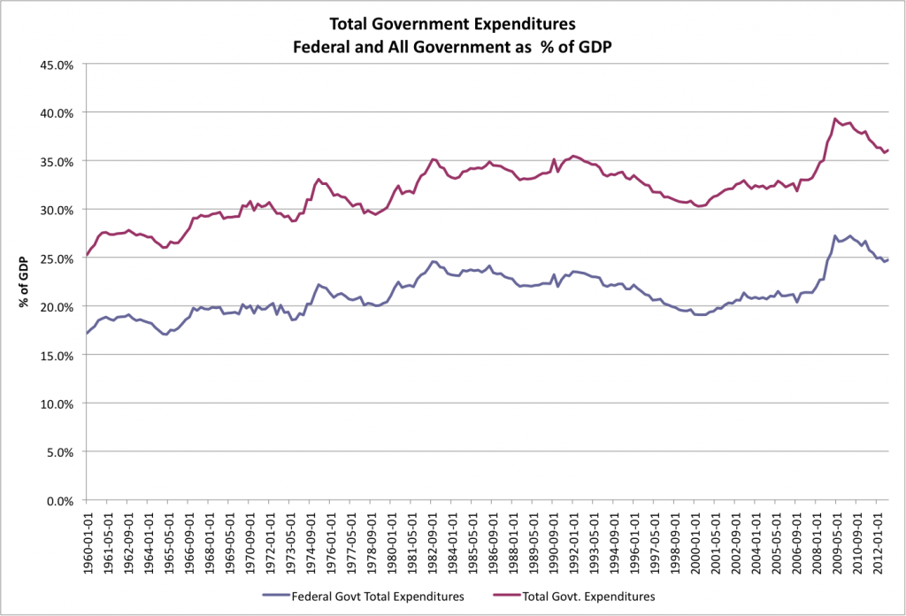
Finally, you can compare the spending to our economy’s capacity to sustain it, which means taking the nominal series Yglesias uses and comparing it to nominal GDP, which I’ve done below for both federal and total expenditures:
One thing Yglesias and I would agree on is that current outlays are decreasing. The difference, as I pointed out in a rant about Ezra Klein’s alleged killer graph, is that we are coming off of HUGE increase in government spending compared to our capacity to pay. All of these appropriately adjusted graphs reveal the huge relative increase in spending in 2009. Worse, we are facing much larger increases in entitlements that will pressure that number higher, so we need to either reform entitlements or find savings in the discretionary budget (or both, more likely). “Stimulus” is supposed to be temporary. I don’t think either Yglesias or Klein, or any of those waving around spending graphs that show modestly decreasing slopes in the last few years, fully concedes that they are arguing that stimulus-level spending should be our new baseline.


Literature search includes analysis of trade publications,
government reports, and corporate literature. Pessimistic view is base on the biggest obstacles for photovoltaic industry
is the high cost. In existing thin layered solar cells, the electrodes are produced from a metal and indium tin oxide.